Making a Bézier Spline, and Updates
It’s been awhile since I’ve written a blog entry here, and when I say awhile, I mean almost months. There are a few reasons for this absence:
Life.
These past months have been full of wins and challenges preparing for life after graduation. My senior quote is by Audre Lorde: “I am my best work - a series of road maps, reports, recipes, doodles and prayers from the front lines”.
GIS and ERA
I’ve been receiving assistance from some experienced data scientists to further the GIS side of things, and finally converting geoTIFF files to geoJSON in a convenient way once and for all. One of these friendly souls who works at a major bank showed me how to accomplish the data conversion through a python library, Rasterio. Also with the contining help of Ted Kim, our next plans are to run the files through his script, and go from there. More about this and its importance will be in a separate blog.
I’ve been working on a mock-up of Joseph Potvin's 'Earth Reserve Index Policy Curve' in a Jupyter Notebook! I’m pretty excited about this because, although in practise it's as mundane as plotting points, it's a signal to me that my familiarity with this platform has improved since my last blog. Xalgorithms Foundation has a work culture that balances doing what are you already good at, with what would you like an opportunity to learn your way into. While makng my first Jupyer Notebook the hardest part was figuring out how to insert my own data and create data frames properly, but I did it. Now I have a couple graphs, albeit I am still working and toggling with them.
A Bit of Background
Okay so now I’ll try to relate what this Earth Reserve Policy Curve means. At Xalgorithims, I focus on the Earth Reserve Assurance Framework, and this curve is just one component.
Based on the white paper description, this method is used to simulaneously transcribe multiple indicator values, each maintained in its original units of measure, into a common index. This is done with a [-100%]—[0]—[+100%] scale, which is actually two adjacent scales. One stretches all the way from the base year of [0%] change, to [-100%] of the worst scenario to be avoided for each indicator. The other stretches all the way from the base year of [0%] change, to [+100%] of the optimal feasible scenario reasonably achievable for each indicator.
This is done with percentages on the x-axis so that each indicator, no matter what type or units of measure, can be included onto the same y-axis, which is purely numeric. The y-axis values for each distinct type of indicator can then be combined through a weighted average into a single index.
The “Bézier Spline” (named after its designer, Renault engineer Pierre Bézier) is just a useful way to draw continuous curves by using a few simple equations. It provides a convenient way to adjust all aspects of slope and curvature of the deliberately-designed S-shaped "ER Policy Curve", by managing (through policy negotiations among stakeholders) just two endpoints and two control points. Here is an accessible intro to "splines".
Potentially any shape of curve could be used, but the policy intent of the S-shape we want for this curve is to have an Earth Reserve Index that extends asymptotically the closer any component indicator gets to the level of a worst case scenario. This creates a passive market disincentive that accelerates in intensity the closer an indicator gets to that declared worse case scenario, never reaching [-100%]. This policy mechanism establishes an explicit, gradual but impassable deterrence.
Then in the other direction, the curve should gently increase its downward slope the closer any component indicator gets to its optimal case. This is designed to passively incentivize the additional costs of innovation to reach [+100%] of the way to the best feasible scenario. The middle of this ER Policy Curve is somewhat straight but it is not level. It slopes to provide a moderate passive incentive even at the base year where each indicator is near [0%] of the distance to the worst or best scenarios.
The precise shape of the entire curve can be updated over time, in response to the outcomes of policy negotiations. Even though all the deliberations towards negotiated consensus about the indicators and the curvatures will be complicated in the background, the Earth Reserve Policy Curve in the foreground interface is adjusted by gently and gradually shifting just four points on a chart.
Where is this leading? The Earth Reserve Index can be used for indexed pricing in dynamic ('smart') contracts, as a reasonable and verifiable way to link free markets with ecosystem integrity. The the “Earth Reserve Assurance (ERA) Framework describes a new method available for the determination of monetary worth and quantity in a multi-currency system with no central reference unit of account. I won't try to explain that whole system here, but Jacob Kelter and others at the Centre for Computational Learning at Northwestern University have created an agent-based model to show how this works. You can watch a video of their demo here: https://era.xalgorithms.org/
What I'll do here is provide just a brief comment on how that system depends on the shape of the Bézier Spline which is used as a policy curve to generate the Earth Reserve Index. A geographical area’s productive capacity is determined by various factors such as: the quantity and quality of its water, minerals, topsoil, metals, species populations, and so on. Positive and negative changes in these factors in the direction of the worst or best scenarios will affect the Earth Reserve Index.
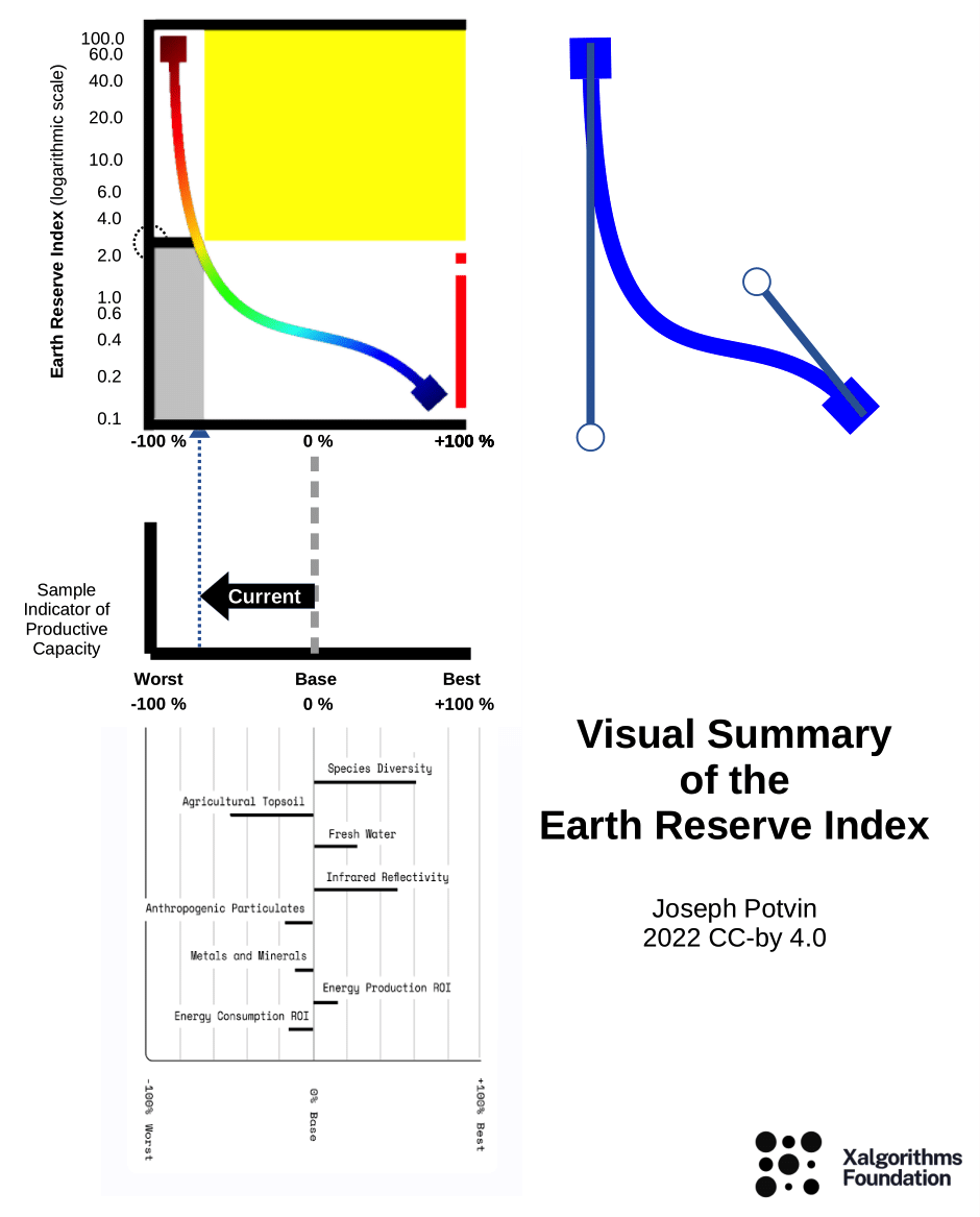
The numbers on the X-axis represent the percentage each indicator at the present time has changed from a base year towards the worst/best scenario. The numbers on the Y-axis, are used to calibrate the multi-factor components of the Earth Reserve Index. You can toggle zoom in and out to certain values on the index and x axis to see the values close up. On the next plot you can see the percentage indicators moving as one cohesive point across the graph over the ER index with the ability to slide the point over different percentages. This helps to visualize the shape of the curve over time.
What I'm Still Working On
This is a work-in-progress. First I need to discuss the current state of this implementation with the wider team, to make sure what I have is consistent with the design intent. Then there are some useful features to add. For example there should be a way for readers to drag the end-points on the graph. I am currently using Plotly, and still trying to figure out how to add an equation to plot rather than just a table. If users can’t choose the endpoints, I would at least like to add a scale that can be toggled. I would also like them to be able to zoom in and out of the graph just like the ones you see above.
The plots are important not only for visualizing the Earth Reserve Index, but also for my own learning and understanding. I do feel like my familiarity with the Python programming lanuage has gotten better these past couple months, and I'll continue to advance the implementation in Jupyter and improve its interactivity.

Deja Newton
Deja has been contributing to Xalgorithims since the beginning of 2021, collaborating on Geographic Information System (GIS) data implementation in the Earth Reserve Assurance (ERA) design and communicating her journey and through blogs. Deja is an Environmental Planner and avid environmentalist.